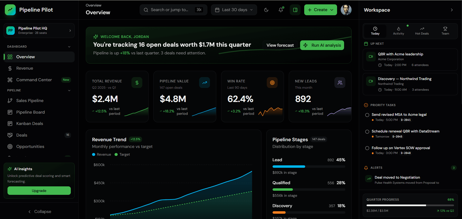
A dashboard screenshot can look excellent while the source is difficult to extend. The useful question is not whether the demo looks polished; it is whether the template gives your team a dependable starting point for a real product.
Check The Application Structure First
Start by identifying where routes, layouts, reusable components, data adapters, styles, and shared utilities live. A good template makes these boundaries easy to discover. You should be able to find the navigation definition, add a route, replace a chart data source, and change a design token without tracing unrelated files.
Look for a clear distinction between server-rendered content and interactive client components. Templates that mark most of the application as client-side often ship more JavaScript than necessary and make permissions, metadata, and data fetching harder to reason about.
- Routes and layouts follow a predictable folder structure
- Shared UI is separated from page-specific composition
- Navigation and permissions are defined centrally
- Environment variables are documented without committing secrets
Inspect Real Interface States
Production dashboards spend a surprising amount of time outside the perfect demo state. Tables can be empty, requests can fail, permissions can hide actions, and long labels can wrap. Evaluate whether the template includes loading, empty, error, disabled, and overflow behavior rather than only populated cards.
Try the narrowest supported mobile width and zoom the browser to 200 percent. Navigation should remain reachable, tables should have an intentional small-screen strategy, and buttons should keep readable labels and usable touch targets.
Review Dependencies And Upgrade Risk
Open the package manifest and separate essential dependencies from decorative ones. A proven charting or accessibility library can save months of work. Several overlapping UI libraries, abandoned packages, or unnecessary animation dependencies increase bundle size and make upgrades harder.
Check the framework and React versions, then run the production build. Warnings hidden during development often become deployment failures later. A trustworthy package should type-check without suppressing errors across the project.
Verify Accessibility And Interaction
Use only the keyboard for a short test. You should be able to open navigation, reach form controls, close dialogs, and identify the current focus position. Icon buttons need accessible names, inputs need labels, and status changes should not depend on color alone.
Accessibility is also a maintainability signal. Components built with semantic HTML and established primitives are usually easier to test and less fragile when product requirements change.
Understand What The License Includes
Confirm whether the license covers one client project, multiple products, redistribution, or internal team use. Source access, future updates, documentation, design files, and support are separate benefits and should be stated clearly before checkout.
Keep the purchase receipt and license text with the project documentation. This avoids uncertainty when a different developer or client takes ownership months later.
Run A Thirty-Minute Technical Trial
Before committing a project to the template, change the brand color, add one route, replace one data set, test the mobile navigation, and run a production build. Those five actions reveal more about source quality than a long feature list.
mtverse template pages provide screenshots, live previews, included pages, framework details, and package information so buyers can compare the visible experience with the implementation they actually need.
Explore more on mtverse
Browse dashboard, ecommerce, SaaS, landing page, portfolio, and HTML templates, or explore reusable UI component source.